
Over the years, I’ve marked more than 500 IELTS Writing Task 1 responses. When I open a new document, I usually know what score the student is going to get by the end of the second paragraph.
Task 1 is often treated as the ugly stepchild of the IELTS Writing test. Because Task 2 is worth double the points, candidates spend weeks perfecting their argumentative essays and treat the 150-word Task 1 as a quick afterthought. But here is the harsh reality: Task 1 is a highly rigid, technical data-reporting exercise. It doesn’t matter how beautiful your vocabulary is, if you don’t play by the examiner’s specific formatting rules, your score will flatline at a 6.0.
Achieving a high score on the IELTS Writing Task 1 can be challenging, but it’s not impossible. By identifying and correcting these errors, you can improve your performance and boost your score. Here are the five most common mistakes that can prevent you from getting a Band 6 or higher.
Here are the five most common Task 1 mistakes I see in my students’ writing, the psychology behind why they happen, and the exact formulas you need to fix them.
1. Misinterpreting the Data
Understanding the Task
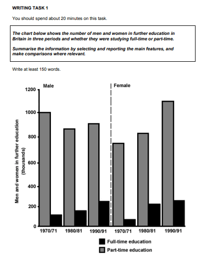
One of the biggest pitfalls in IELTS Writing Task 1 is misinterpreting the data presented in graphs, charts, or tables. This mistake leads to incorrect analysis and poor overall coherence in your writing. For example, in the Writing Task 1 below, instead of saying “830,000 men enrolled in part-time education“, you should say “close to 830,000” or “slightly over 800,000.” This is because we are unsure if the figure is indeed 830,000 or not.
Many students end their essay with a summary that feels like a Task 2 conclusion, trying to explain why a trend happened. Worse, they stuff it full of specific data points.
The Mistake (Band 5.5): > “In conclusion, we can see that more men went to university than women, which is probably because men had more job opportunities in the 1990s. The highest number was 50,000 in 1995.”
Why it fails: 1. Never use the phrase “in conclusion” in Task 1.
2. Never guess why the data looks the way it does. You are a reporter, not a sociologist.
3. Your overview should contain zero numbers.
The Fix (Band 7.0+): You must write an Overview paragraph. I always recommend putting this as your second paragraph, right after the introduction. A high-scoring overview looks at the “macro” picture and identifies the 2 or 3 biggest trends without getting bogged down in the math.
Do this instead: “Overall, it is clear that while university enrollment for men experienced a steady, long-term decline, female enrollment saw a significant upward trend over the period. Furthermore, women eventually surpassed men as the majority demographic by the end of the decade.”
Using this structure ensures that your response is easy to follow and logically organised.
2. The “Shopping List” Approach to Data
Examiners penalize you heavily if you simply read the graph from left to right and list every single number in chronological order. We call this the mechanical or “shopping list” approach. It shows zero analytical skill and will tank your Coherence and Cohesion score. You need not to list down and write every single number. What you need to do is simply look for the main highlights, such as the highest, the lowest, and the average numbers.
The Mistake: > “In 1990, car sales were 10,000. In 1995, they were 15,000. In 2000, they went up to 20,000. Truck sales were 5,000 in 1990…”
The Fix: The Task 1 Academic Instructions explicitly tells you to “make comparisons where relevant.” You need to group data intelligently. Before you write a single word, look at the chart and find the relationships.
Do this instead: In 1990, 10,000 cars and trucks were sold. By 2000, the number of car sales doubled to 20,000.
Did you see how I grouped them together and skipped the 1995 figures? That’s because there was nothing special or unique about these numbers.
| The “Shopping List” Method (Band 5.0) | The “Analytical” Method (Band 7.0+) |
| Writing one sentence for every single year on the X-axis. | Grouping categories that share a similar upward or downward trend into one paragraph. |
| Treating every line or bar as a separate, isolated entity. | Highlighting exactly where two lines intersect or overtake one another. |
| Using “and then” or “next” to transition between data points. | Using comparative transitions like conversely, in stark contrast, whereas, or similarly. |
3. Butchering the Vocabulary: “Amount,” “Number,” and “Percentage”
Vocabulary in Task 1 is incredibly unforgiving. If you use the wrong quantifier for the data presented, your Lexical Resource score drops immediately. I constantly see students mixing up uncountable nouns, countable nouns, and ratios.
The Mistake: > “The amount of people driving to work increased to 40%.”
The Fix: You cannot use “amount” for countable nouns (people), and you cannot use “amount” to describe a percentage. You need to memorize the distinct categories of data vocabulary. Keep this quick-reference guide in mind:
- Use “Amount” for: Uncountable nouns (e.g., The amount of money spent, the amount of electricity consumed, the amount of water used).
- Use “Number” for: Countable nouns (e.g., The number of cars sold, the number of tourists visiting, the number of students enrolled).
- Use “Proportion” or “Percentage” for: Ratios and fractions (e.g., The percentage of the population, the proportion of budget allocated).
- Use “Figure” for: A safe, catch-all term if you are unsure (e.g., The figure for car commuters rose significantly).
Do this instead: The number of people commuting to work shot up by 40%.
4. Single, Concise Intro (The 0-Word Introduction)
Your introduction should be a single, concise sentence that tells the reader what the chart is about. However, if you copy the exact words from the exam paper, the examiner will mentally cross those words out. They will literally not count toward your 150-word minimum, meaning you could be penalized for being under length.
- Original Prompt: The chart below shows the number of men and women in further education in Britain in three periods.
- The Mistake: “The chart below shows the number of men and women in further education in Britain in three periods.” (Direct copy).
The Fix: You must paraphrase the prompt. But don’t just swap out a few synonyms. Change the structural grammar of the sentence to show true fluency.
- Step 1 (Synonyms): Change “shows” to illustrates/demonstrates. Change “number of” to figure for/breakdown of. Change “Britain” to the UK.
- Step 2 (Grammar): Flip the structure.
Do this instead: “The provided bar chart illustrates the gender breakdown of students enrolled in higher education across the United Kingdom during three distinct academic years.”
We rephrased the same thing. This will now be added toward the total word count.
5. Getting Lost in the Weeds (Describing Every Minor Fluctuation)
When faced with a complex line graph featuring four different categories over a 20-year period, panic often sets in. Students try to mention every tiny dip, rise, and plateau. The result is a messy, confusing, and practically unreadable essay. Worse, you will run out of your 20-minute time limit.
The Mistake: Dedicating three full sentences to a line that fluctuated mildly between 10% and 12% for a decade before finally doing something interesting.
The Fix: The instructions ask you to report the main features. You have to learn how to smooth out the noise and summarize plateaus efficiently. Focus your word count on the data points that actually matter: the starting points, the peaks, the lowest points (troughs), and the final figures.
If a line goes up and down slightly for ten years but ends up roughly where it started, use summarizing vocabulary:
- “Despite minor fluctuations, the figure remained relatively stable at approximately 10% until 2010…”
- “The number of sales hovered around the 5,000 mark for the first decade before surging exponentially…”
- “Following a period of volatility, the trend leveled off at 15%.”
Mastering what not to write is just as important as knowing what to write. Stick to the highlights, keep your overview clean of numbers, and group your data logically, and you will comfortably break past that 6.0 ceiling.
To know more about the IELTS writing criteria, visit the following:
IELTS Writing Marking Criteria
Related Post on IELTSKaro:
- IELTS Writing Task 2 Topics Preparation
- GT Letter Writing 10 Tips
- Book 19 Academic Writing Task 1 All Answers
FAQs
1. What is the most common mistake in IELTS Writing Task 1?
The most common mistake is misinterpreting the data, which can lead to incorrect analysis and poor overall coherence in your response.
2. How can I improve my vocabulary for IELTS Writing Task 1?
Practice using words related to data description, such as “increase,” “decrease,” “fluctuate,” “peak,” and “steady.” Reading sample responses and noting the vocabulary used can also help expand your word bank.
3. Why is structure important in IELTS Writing Task 1?
A clear structure ensures that your response is logically organized and easy to follow. This helps convey your ideas more effectively and improves coherence and cohesion, which are critical for a higher band score.
4. How can I avoid grammatical errors in my writing?
Improve your grammar skills by studying common rules and practicing regularly. Use a variety of sentence structures and seek feedback from a teacher or use online grammar checking tools.
5. What should I include in the conclusion of my response?
The conclusion should summarize the key points and trends you have discussed in your response. It should provide a clear, concise summary of the main information presented in the data.